Do you know how important a call to action in eCommerce is? If not, then don’t worry; we will explore everything in this blog. Stay with us and learn about the eCommerce call to action!
In eCommerce, having a clear and compelling call to action to boost sales is crucial. A well designed CAT can guide customers to subscribe to your newsletter, buy something, or interact with your business.
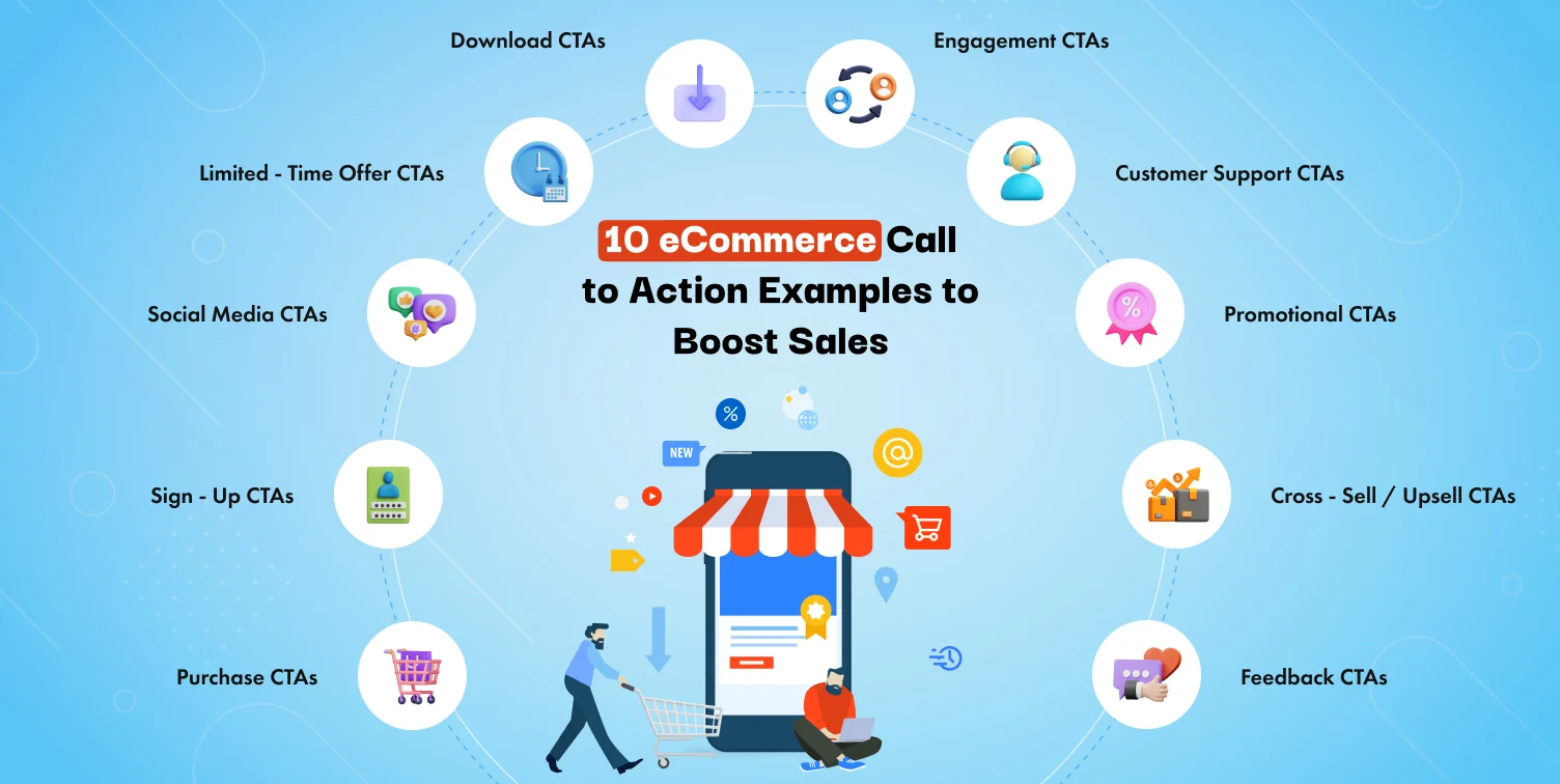
Explore ten eCommerce call to action examples that can increase your sales and enhance consumer interaction. Here, you can check out some popular CTAs that are common and used by every ecommerce website. Some common CTAs are such as Purchase CTAs, Sign Up CTAs, Social Media CTAs, Limited Time Offer CTAs, Download CTAs, Engagement CTAs, Customer Support CTAs, Promotional CTAs, Cross-Sell / Up-sell CTAs, and Feedback CTAs.
In this blog post, we can learn what CTA is and get tips on optimizing CTA. So, let’s dive deep into the world of eCommerce call to action.
What is an eCommerce Call to Action?
Suppose we discuss a call to action (CTA) in eCommerce. In that case, CTA is a prompt that inspires visitors to do specific actions, such as buying something or subscribing to updates. CTAs help customers navigate the purchasing process, helping them move from one stage to the next, from browsing to adding products to their cart.
Why Are Call to Actions Crucial in eCommerce?
A call to action plays a crucial role in eCommerce because it is the center of attraction to keep your users engaged with your website or store. Here are a few points why it is crucial:
The Role of CTAs in Conversion Optimization
Influential CTAs can improve your sales by encouraging visitors to act. A simple “Buy Now” button with a compelling CTA can turn your website visitors into paying customers. If we take other examples that contain “Add to Cart” or “Shop Now,” which are conversion focused CTAs.
How CTAs Impact User Experience
CTAs give your customers a clear direction. They help your visitors explore your website effortlessly, making it easy to find what they seek. A well placed CTA button like “Learn More” or “Explore” can sweeten the user experience..
10 Most Used eCommerce Call to Action Examples
Let’s explore the mostly used 10 eCommerce call to action examples that help you boost sales and enhance customer experience:
Purchase CTAs
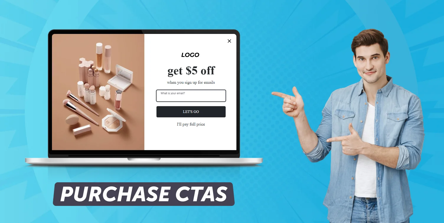
On any eCommerce website, a purchase CTA is the most essential section. These CTAs encourage customers to complete their transactions, which immediately increases sales. Whether “Buy Now” or “Add to Cart,” these buttons should instantly catch the user’s attention and encourage immediate action. Influential purchase CTAs improve conversion rates by clarifying how to purchase.
- Purpose: To attract customers to make the purchase.
- CTA Phrases: “Buy Now,” “Add to Cart,” “Shop Now.”
- Design Ideas: Use bold, contrasting colors that stand out from the background, such as red or green. The button should be large, easy to click, and placed near product images or descriptions. Include a product image to emphasize what the user is buying.
Sign-Up CTAs
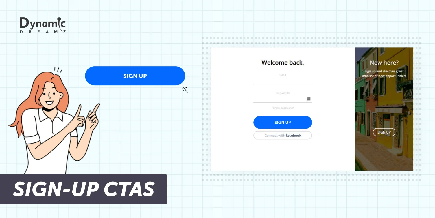
A sign-up CTA helps you to grow your client base by encouraging visitors to join an email list or create an account. But the main thing is you have to give something in return. Offer some value, like a discount or free content, to motivate visitors to sign up. By doing this, you can create a direct communication channel with potential buyers, leading to future sales.
- Purpose: To motivate visitors to join an email list or register for an account.
- CTA Phrases: “Sign Up Today,” “Join Now,” “Get Free Access.”
- Design Ideas: Create a form so visitors can input their email or details. Offer a discount code or free eBook to attract users. Use soft colors with one bold accent color for the CTA button.
Social Media CTAs
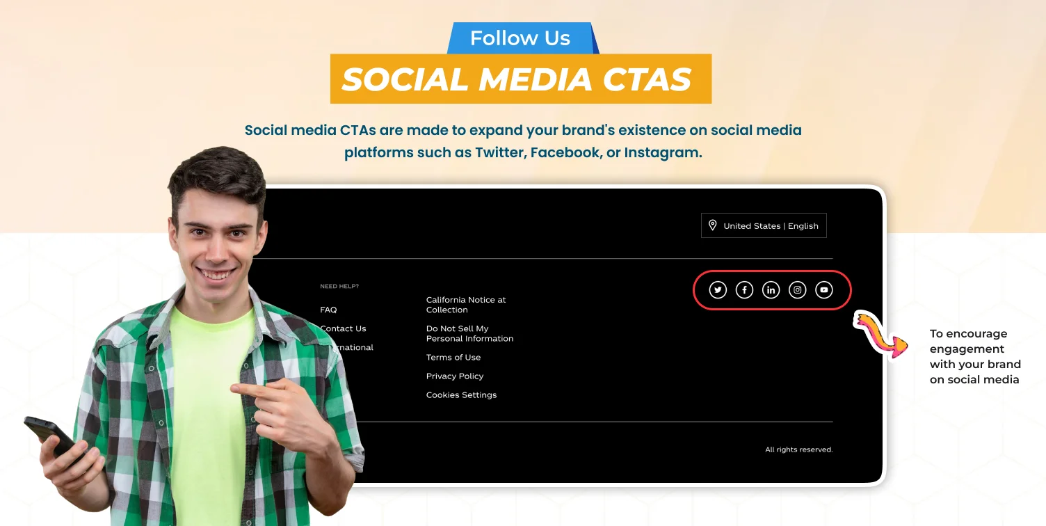
Social media CTAs are made to expand your brand’s existence on social media platforms such as Twitter, Facebook, or Instagram. These CTAs inspire visitors to follow your brand or share your content. It expands your audience and boosts community engagement. Social media CTAs are essential for sustaining customer interaction and increasing online presence.
- Purpose: To encourage engagement with your brand on social media.
- CTA Phrases: “Follow Us,” “Share This Post,” “Like and Share.”
- Design Ideas: Use social media icons (Facebook, Instagram, Twitter) along with an eye catching “Follow” or “Share” button. Use bright, recognizable brand colors from social media platforms, and add playful graphics that reflect your brand’s tone.
Limited-Time Offer CTAs
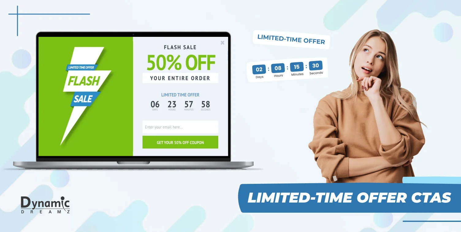
A limited time offer CTA is the best example of FOMO. FOMO stands for fear of missing out. Use phrases that can create urgency, such as “Limited Time Only” or “Offer Ends Soon,” to encourage buyers to act fast so they don’t miss the opportunity. The best use of these CTAs is when promoting seasonal products or during sales, motivating customers to purchase before the sale ends.
- Purpose: To create urgency and push customers to act quickly.
- CTA Phrases: “Limited Time Only,” “Offer Ends Soon,” “Hurry, While Stocks Last.”
- Design Ideas: Use bold, attention grabbing colors like red or orange, and include countdown timers or urgency phrases like “Only 2 Left”. Place these buttons near product images or promotional banners.
Download CTAs
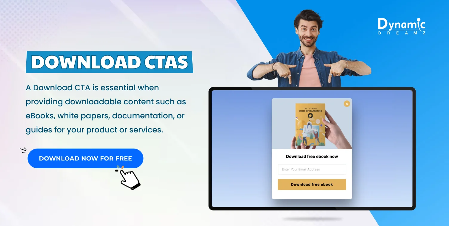
A Download CTA is essential when providing downloadable content such as eBooks, white papers, documentation, or guides for your product or services. The main goal of this CTA is to capture important lead information, such as their email, for future marketing while offering customers some valuable content.
- Purpose: To offer free content, such as eBooks or guides, while collecting customer information.
- CTA Phrases: “Download Now,” “Get Your Free Guide,” “Download Free eBook.”
- Design Ideas: Use a clean, modern layout featuring a cover image of the eBook or guide and a bold “Download” button. Add trust building elements like “No Spam” guarantees or “Instant Access” text.
Engagement CTAs
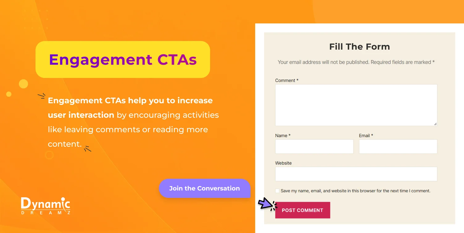
Engagement CTAs help you to increase user interaction by encouraging activities like leaving comments or reading more content. These CTAs effectively deepen the brand’s and its customers’ relationship, foster a sense of community, and encourage repeat visits.
- Purpose:To encourage interaction with your content.
- CTA Phrases: “Leave a Comment,” “Read More,” “Join the Conversation.”
Design Ideas: Keep the layout open and straightforward, focusing on user engagement components like comments or reactions. Use speech bubbles or conversation icons to represent engagement.
Customer Support CTAs
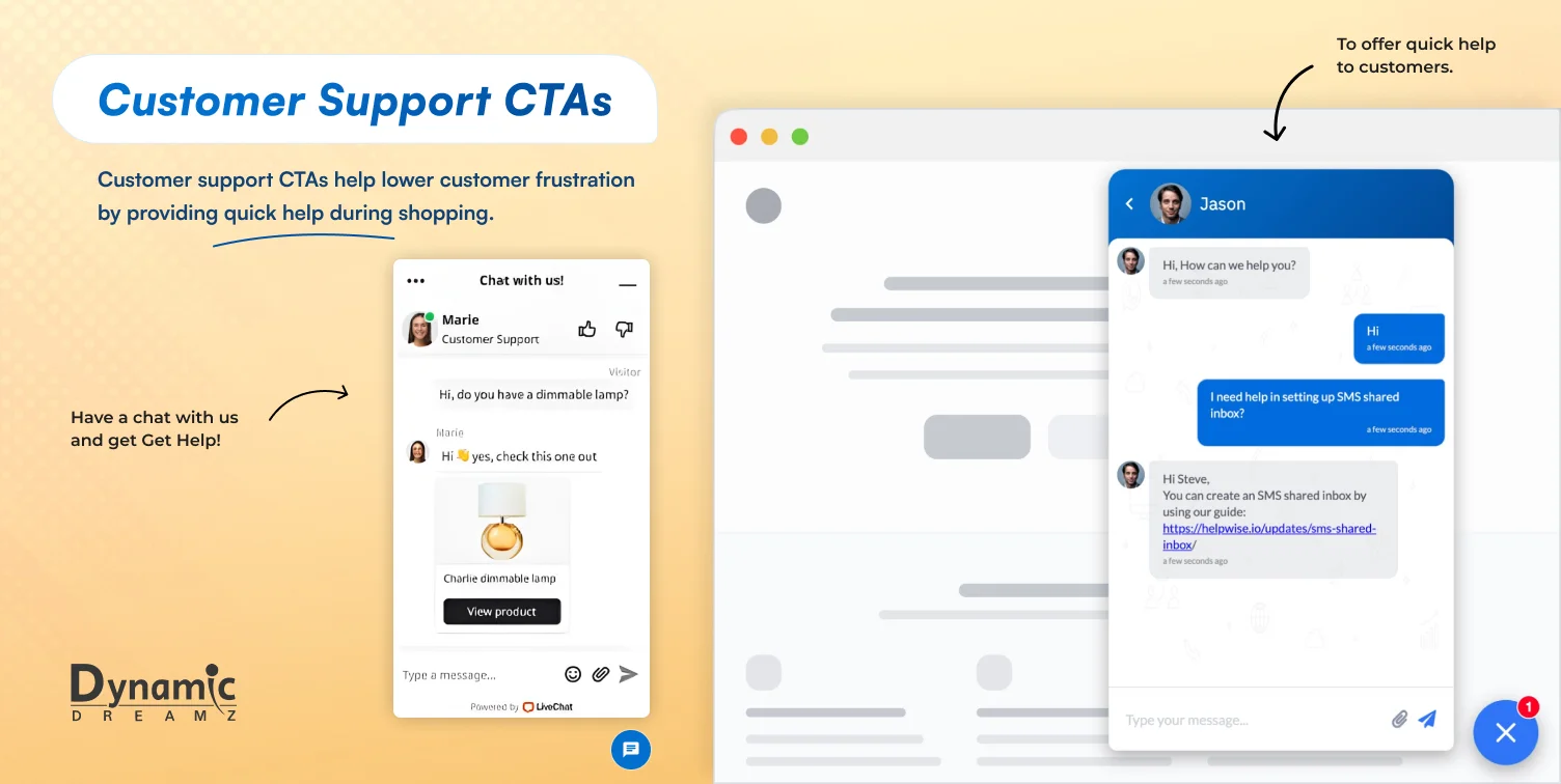
Customer support CTAs help lower customer frustration by providing quick help during shopping. CTA buttons like “Chat Now” or “Get Help” are crucial for eCommerce websites where users have queries or inquiries about products, shipping, or other services. They increase the chance that a customer will complete the transaction by assisting them as they navigate the purchasing process.
- Purpose: To offer quick help to customers.
- CTA Phrases: “Chat Now,” “Get Help,” “Live Support.”
- Design Ideas: Feature a chat box icon or a friendly face to represent customer service. Use bright colors like blue or green to indicate trust and help. Position it on the lower corner of the screen where chat widgets are commonly found.
Promotional CTAs
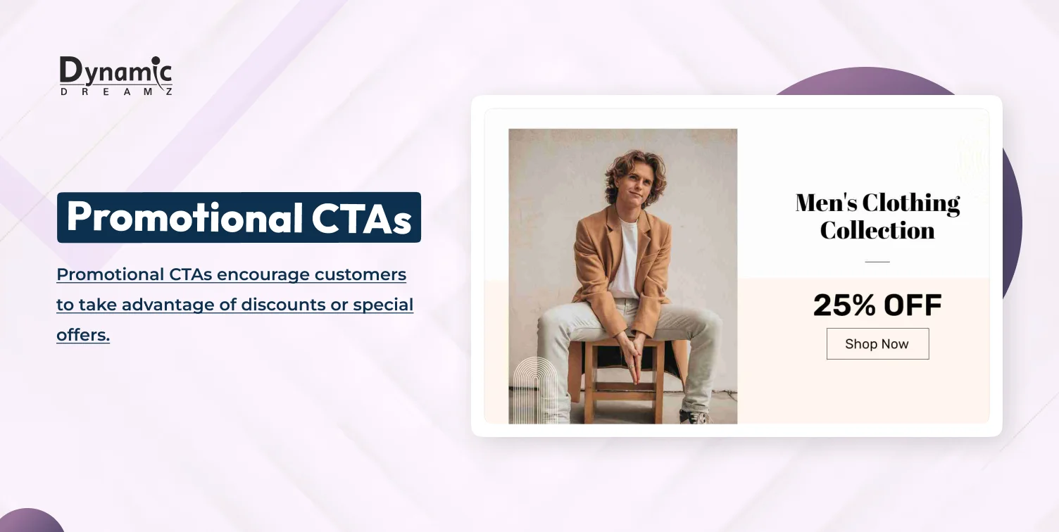
Promotional CTAs encourage customers to take advantage of discounts or special offers. These CTAs should convey the value of the promotion, making them an excellent tool for attracting price sensitive customers and boosting conversions during sales events.
- Purpose: To offer discounts and motivate purchases.
- CTA Phrases: “Get 20% Off,” “Claim Your Discount,” “Exclusive Offer.”
- Design Ideas: Use festive, celebratory designs like confetti or discount badges. Incorporate a large, bold discount percentage, and make the CTA button prominent.
Cross-Sell / Up-sell CTAs
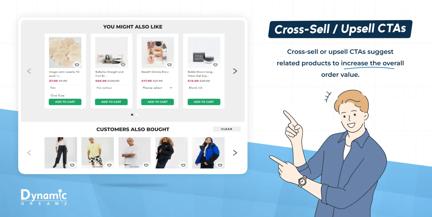
Cross-sell or up-sell CTAs suggest related products to increase the overall order value. These CTAs are typically placed on product or checkout pages, encouraging customers to add complementary items to their cart. They’re highly effective in boosting average order value (AOV).
- Purpose: To recommend related products and increase order value.
- CTA Phrases: “You Might Also Like,” “Customers Also Bought,” “Complete the Look.”
- Design Ideas: Display recommended products in a carousel or grid format below the main product, with a CTA button next to each recommendation. Use a subtle design so as not to overpower the main product.
Feedback CTAs
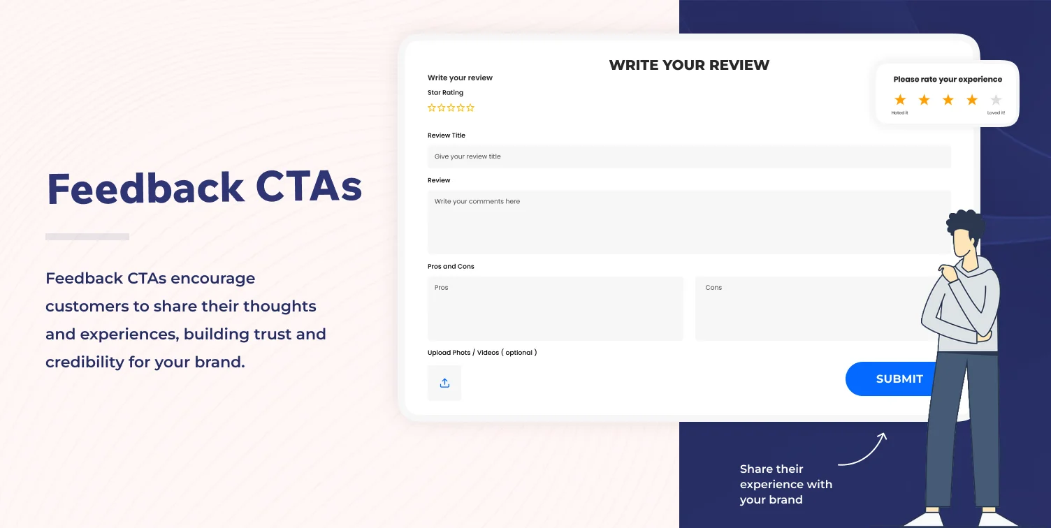
Feedback CTAs encourage customers to share their thoughts and experiences, building trust and credibility for your brand. Encouraging reviews or ratings not only helps future buyers but also provides you with valuable insights into customer satisfaction.
- Purpose: To encourage customers to share their experience with your brand or products.
- CTA Phrases: “Leave a Review,” “Rate Your Experience,” “Give Us Feedback.”
- Design Ideas: Feature a star rating system or feedback form that is visually appealing and easy to fill out. Add personal touches, like images of happy customers, to make the process more inviting.
How Many CTAs Should You Add in Marketing Content?
Too many CTAs can confuse your audience, generating decision fatigue or confusion. On the other hand, too few can miss valuable conversion opportunities. However, a small number of them may miss significant chances for conversion. The optimal number of CTAs relies on the type of content, the customer’s stage in the buyer journey, and the specific goal you’re trying to achieve.
Shorter content, like social media posts, email newsletters, and one to two CTAs, is enough. These should be strategically placed to direct readers toward a single and clear action — clicking a link, signing-up, or making a purchase.
For longer content, such as landing pages, product pages, or blog posts, you can add multiple CTAs. For example, a product page might have an “Add to Cart” button, a “See More Details” link, and a cross-sell recommendation like “You Might Also Like.”
It’s crucial to properly space out CTAs and make sure they’re all relevant to the surrounding content. A page with too many CTAs can make the opposite impact on users, making them feel pressured rather than encouraged to take action.
Ultimately, the goal is to guide your audience smoothly via their journey, whether to purchase, sign-up for a service, or engage with your brand in other ways. Each CTA should appear like the next natural step, creating a smooth, intuitive user experience.
How Can I Write an eCommerce Call to Action?
Consider the funnel stage: Customize your CTAs based on the customer’s current stage in the purchasing process. Early in the funnel, CTAs like “Learn More” work well. Later, stronger CTAs like “Buy Now” are more appropriate.
Make early offers low risk: Use low risk incentives to encourage participation, such as “Free Trial” or “Download a Free Guide.” These are great for building trust before asking for a purchase.
Use urgency to increase conversions: FOMO phrases like “Limited Time Offer” or “Only a Few Left” can create a fear of missing deals, so customers act faster to make purchases.
Test different colors: The color of your CTA button and the background of the section matter. Red and orange are usually used for “Buy Now” buttons because they appear more vibrant. Test various colors to see which ones get more clicks.
Use a simple CTA button and message: Keep your CTA text short and straightforward. A clear, actionable message like “Get Started” is more effective than lengthy text.
Use captivating hero images: Add a hero image next to your CTA to attract attention. Images of products or services can increase engagement.
Keep it above the fold: CTAs should be visible without scrolling. Positioning them “above the fold” confirms that customers see them instantly.
Tips to Optimize Your CTAs for Better Performance
A/B testing your CTAs: Test different CTA variations to find which CTA works best. Tools like Google Optimize can help you run A/B tests to see which CTA gets the most clicks.
Analyzing CTA metrics: Track metrics like click through rates (CTR) and conversions to evaluate the effectiveness of your CTAs.
Adapting CTAs for mobile users: Ensure your CTAs are mobile friendly, so buttons are easy to tap and the text is readable on smaller screens.
How not to use CTAs:
- Do not add too many CTAs on one page.
- Do not use unclear text like “Click Here.”
- Do not hide CTAs below unnecessary content.
Conclusion
Effective calls to action (CTAs) are essential for driving conversions and boosting sales in eCommerce. You can more efficiently guide your customers through their buying journey by strategically implementing the right CTAs—a “Buy Now” button, a sign-up prompt, or an urgency based offer.
The key is to keep your CTAs clear, compelling, and relevant to the user’s intent. Remember to test different CTA designs and placements to optimize performance. With these tips and examples, you can create compelling CTAs that drive conversions and increase customer engagement.
Apart from CTA, if we talk about eCommerce websites or stores, we can help business owners and entrepreneurs create eCommerce stores. We will use Shopify, WooCommerce, Magento, BigCommerce, WordPress, and Laravel to build your eCommerce stores and websites.
You can contact us with your detailed project requirements so we can analyze them and get back to you with a detailed outline.
FAQs
How can I make my CTAs more effective?
Ensure your CTAs are clear, concise, and action driven. Use a strong message and offer something valuable to the customer, like a discount.
How many CTAs should a landing page include?
Add 1-2 primary CTAs on a single page. Don’t overwhelm or confuse users by adding too many CTAs.
What are the best call to action phrases to use?
Phrases like “Buy Now,” “Get Started,” and “Claim Your Discount” are highly effective. They’re clear, actionable, and create a sense of urgency.
Where should I place CTAs on my eCommerce website?
Position CTAs at the start of the page to guarantee they are visible without scrolling. You can also place them near product descriptions or checkout sections for optimum results.
Should I use images with my call to action buttons?
Yes, adding images next to your CTAs can increase visibility and engagement. Use hero images or product photos to make your CTAs stand out.
