The making of Nekter Juice Bar
Nekter Juice Bar is a well known brand offering fresh juices and healthy products. When they approached us, they wanted their website to reflect their vibrant identity and simplify ordering for their popular product, Cleanse. Additionally, they needed a store pick up option and order facilities at each location to cater to their numerous branches.
- IndustryFood & Beverages
- technologyShopify
- LocationUSA

Challenges
Nekter Juice Bar's main challenge was to ensure their website looked as fresh and inviting as their brand. Being a mega brand, they needed a site that stood out. Their famous product, Cleanse, required a straightforward ordering process to make it easy for customers to purchase. They also wanted to offer a store pick up option because their multiple locations required a robust system to handle orders at each site. Meeting these requirements was crucial for enhancing customer experience and operational efficiency.
Solution
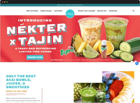
To meet Nekter Juice Bar's needs, we completely designed its website to align with its vibrant and fresh identity. The new design is unique and eye catching, ensuring it attracts more customers. We streamlined the ordering process, particularly for their famous Cleanse product, making adding items to the cart simple with minimal steps. We also implemented a store pick up option, allowing customers to choose their preferred location for collection. Additionally, we developed order facilities for each area, ensuring smooth and efficient operations across all branches.
Services Provided
- Design Prototype
- Frontend Development
- Backend Development
Wireframes
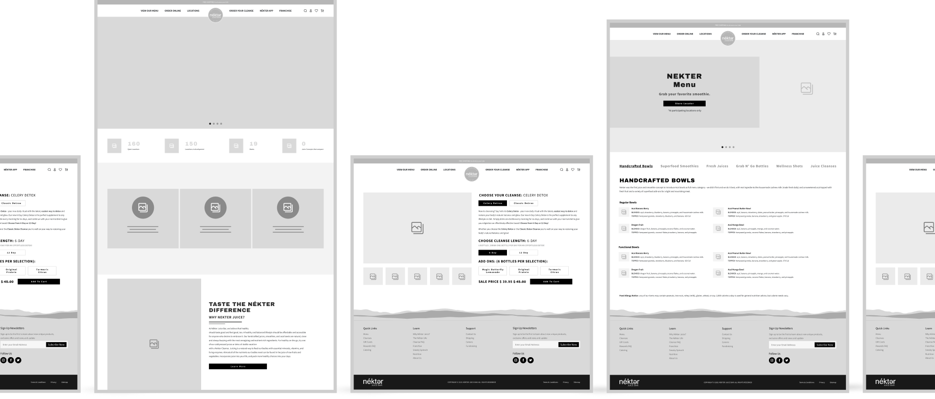
We provided detailed wireframes for Nekter Juice Bar's new store theme. These wireframes illustrated the layout and functionality of each page, ensuring a user friendly experience. The wireframes served as a blueprint, guiding the design and development process to effectively meet the client's requirements.

Colors
#33C0CC
#E03651
#DF8A0A
#24272A
Typeface
Design
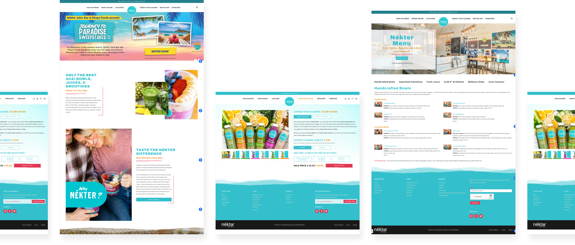
Our design of Nekter Juice Bar's store focused on creating a fresh, modern look that aligns with its brand identity. We used vibrant colors and clean layouts to make the website visually appealing. The new design attracts customers and enhances the overall user experience, making it easier for visitors to navigate and find their desired products.
