The making of ConsciousPoker
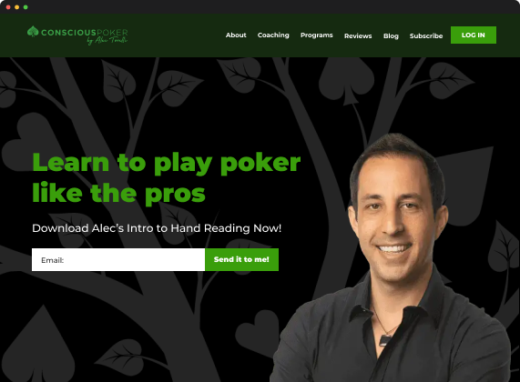
ConsciousPoker is a vast platform aimed at poker lovers who want to improve their game via structured learning and professional guidance. The founder of ConsciousPoker is Alec Torelli, a professional poker player. ConsciousPoker offers a range of resources, including articles, videos, and courses designed to help poker players at all levels. The goal is to provide educational resources for poker players of all levels.
- IndustryEducational
- technologyWordPress
- LocationUSA

Design
The client comes with detailed requirements to accomplish their vision for Conscious Poker. They needed a membership website with a professional design that performed smoothly on both desktop and mobile. It was also compulsory to have a visually attractive and secure login page. The website must feature five complete course programs and integrate the ActiveMember360 plugin for efficient membership management. The real challenge was to develop a website design that looked professional and engaged users, inspiring them to sign up for courses. The client desired a website design that echoed their brand's dedication to educating poker players while driving user attention and course sales.
Solution
To satisfy the client's needs, we launched a multi step process. First, we designed a responsive membership website that delivered a uniform experience across all screen size devices. We created a professional login page, confirming it was secure and inviting. The five course programs were structured and integrated into the website, providing a smooth learning experience for users. Using the ActiveMember360 plugin, we simplified the membership management process, making it easy for users to access their online poker courses. Our website design focused on user engagement, with a responsive layout and visually attractive components that reflected the client's brand.
Challenges
- Design Prototype
- Frontend Development
- Backend Development
Wireframes
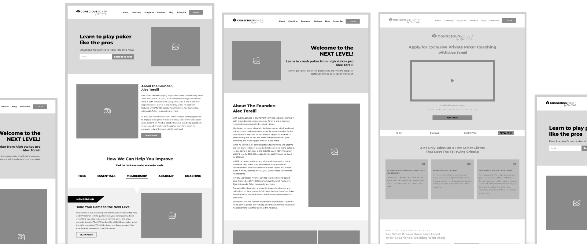
Wireframes were our first step in outlining the website's structure and navigation. These wireframes served as blueprints, allowing the client to imagine the layout and navigation of the website. By concentrating on usability and functionality, we confirmed that each element was strategically set to improve the user experience. The wireframes delivered a clear outline for the design phase, ensuring that the final product was user friendly and aligned with the client's concept.

Colors
#3A9E0B
#DAEDD1
#152A10
#333333
Typeface
Design
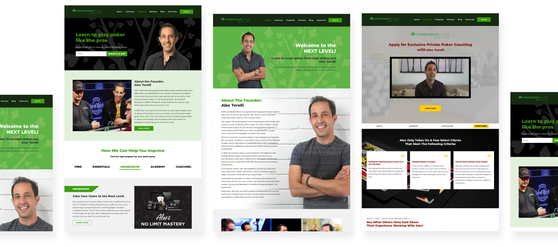
Our design team transformed the approved wireframes into a visually good looking website. We included the client's branding elements, creating a cohesive and professional look. The website design was concentrated on user engagement, with clear calls to action and easy navigation. Each course was showcased with attractive graphics and straightforward descriptions, making it easy for users to understand what was offered. The outcome was a polished, businesslike website conveying the client's dedication to delivering the best possible poker education.
